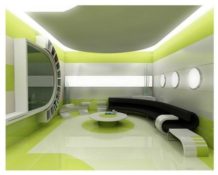
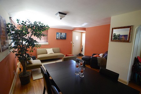
Colour offers the simplest, cheapest and most effective way of transforming a room. Just by painting the walls, you can totally alter a room’s atmosphere.
You can also use colour, whether fabrics, paints or papers, to disguise bad features, highlight good ones and even alter proportions. To use colour effectively you must first understand its language and characteristics. Different colours have different properties and once you have mastered a few basic rules, you will be able to make colours work to your advantage. With the right colour scheme, design, and interior painting you can set the mood for anything.

The overall effect of any colour will be influenced by other elements, such as lighting, objects in the room (furniture and pictures), as well as the materials, textures and finishes used.
For a basic understanding of how colours work, start by looking at the colour wheel. Colours lying on opposite sides of this wheel are called complementary colours – for example, red and green, blue and yellow. These colours have a strong visual resonance so will always work well together, as long as they are used in equal measure and intensity.
Harmonizing colours are those of the same intensity, such as yellow and orange, and these sit together on the colour spectrum. Put together they create a very restful atmosphere. Monochrome schemes use various shades of a single colour, so tend to be quite muted.
effects of colour
Learn to distinguish warm from cool colours. Warm colours are based on yellow undertones, while cool colours are based on blue undertones. Any shade of colour can have either a warm or cool base, depending on the colours used to make it up. This is especially true of green, which falls in the middle of the colour spectrum, halfway between the warm end, consisting of red, orange and yellow, and the cool end, consisting of blue, indigo and violet. This means green can either be made up using warm yellows or cool blues. Rooms painted in warm colours will feel comfortable and welcoming, while cool colours will make a room feel sophisticated and refreshing, yet relaxed.
So it follows that certain colours are more suited to certain rooms with particular functions than others. For example it would not be very sensible to paint a study in too restful a colour, while a bedroom painted a vibrant orange will not contribute towards a peaceful night’s sleep.
properties of colour
While individual colours have their own distinctive characteristics which affect us in different ways, the mass of colours can be divided into light and dark shades, and these can be used to create optical illusions which will alter our perception of space.
Dark shades can be grouped together and described as advancing colours. This is because they make objects painted in those colours appear closer than they actually are. The colour brings the object forward. This characteristic can be very useful if you have, for example, a room where the ceiling is disproportionately high for its length and breadth. Simply paint the ceiling a dark colour and it will appear lower. It is much cheaper than putting in a false ceiling.
Lighter shades work in the opposite way, and so are called receding colours. These can also be used to play visual tricks when decorating, for example, by painting a small room with receding colours you will make it feel more spacious.
Many factors can affect a finished colour. For example, colours look different according to the surface on which they are painted. Paint the same colour onto a wooden surface and a wall (whether plastered or lined with paper) and the results will be very different, the tone of the colour changing according to the surface.
Similarly juxtaposing certain colours can also change their appearance – yellow with white becomes more diffuse, while placed alongside black it seems more intense.
Colour therapy
Every colour has its own particular association that is powerful enough to affect our moods. Just by picturing the colour blue you may find yourself thinking of water and the sky. The overall effect is tranquil and fresh, which makes it an excellent choice for living rooms, as well as being a natural choice for bathrooms and kitchens.
Yellow conjures up images of sunshine, making it vibrant and stimulating – a very uplifting colour. Orange is also very dynamic and lively, as is its relation, red. Red is vital, and is associated with excitement, while at the same time being extremely inviting and warm.
Green is the colour of nature – of grass and leaves. As such it is a colour with remarkable calming powers, hence the existence of green rooms in hospitals.
White is a very clean colour, and promotes an atmosphere of simplicity and serenity. It can be warm or cool depending on which colour dominates the mix used to make it up.
White also has wonderful light-reflective powers, unlike black, which absorbs light. Black needs to be used with care. Too much is oppressive, yet a small amount can look very striking, and combined with colours such as deep reds or purples will look dramatic and opulent.
As a group the neutral colours, soft pastels and whites are naturally soothing. However the make-up of the colour can dramatically change its effect. Cream, for example, may contain yellowy greens, and when choosing a white it is often better to pick one with a hint of another colour in it to avoid it looking too clinical.
The shade of the colour also has a bearing on how we react to it. In the case of blues and greens, the pale shades, cool watery colours, are wonderfully restful and refreshing, while the darker blues and greens, having more depth, are richer.
inspirational colour
When choosing colours, a good starting point is to consider which colours you like the most, and which ones you feel most comfortable with – your instinctive choices. A look around your home will reveal your favourites.
Allow yourself to draw inspiration from any and every source, whether it be nature, a painting, a photograph in a magazine or even a scrap of material. Then think about your furniture, pictures and rugs. Are there any recurring colours you could pick out for the walls and use as the basis of a colour plan? After all, unless you have an unlimited budget and can afford to throw away all your furniture and start again from scratch, then the colours should either complement and harmonize in some way, or else provide dramatic contrasts.
Like clothes, colours have their moment of high fashion. This is becoming more pronounced every year as more and more fashion designers branch out into the interior design and paint market, and paint companies follow the decrees of fashion, changing their paint range annually and producing paints which mimic fabrics – such as denim and suede.

While the colours and effects of the moment may be tempting, it is worth remembering that a highly fashionable look may be dated in a year. A more classic, timeless colour scheme has the advantage of lasting for decades and can always be updated with a fashionable accessory.
For colours that hold their charm over time, take inspiration from history. Period houses, whether they be manor houses or artisans’ cottages, can spark off numerous ideas. Many companies now do their own range of historical paints, so it is easy to reproduce these looks.